After being briefed in at the Workshop by Paul Ward and Justine Gaubert on Friday 8th April I took in all they had to say and made some notes and decided that i should now look into a few various charities to get a better understanding on what charities are all about.
I thought what better place to start off than Silent Cities themselves so here we go.
After looking through page after page on Silent Cites' website I now know a lot more about who and what the charity is all about.
Silent Cities is the actual foundation of the charity and Silent Sheffield is its first local Pilot charity. The overall aim of the charity is to help give silent individuals/ communities a voice and help them through their problems which can range from anything at all for example it could be a problem relating to being homeless, victim of sex trafficking, lack of confidence, long term unemployment, anti social behaviour problems and much, much more. Basically any sort of problem that there is within a community that falls on deaf ears Silent Cities is there to listen and help.
They have done a lot of different projects to help individuals and groups within the community. One I liked in particular was a scheme they called "From Young to Old" where the charity teamed up with a local school in Maltby, Rotherham and set up a training program to teach the older generation how to use a PC.
The clever part is they trained up the school pupils that was aged between 12 and 16 and how to do various basic tasks on a Pc such as turn it on, how to use a mouse, how to use a keyboard and how to browse the internet etc. Most of which the children already knew then they would set up a class after school with around 20 older people at a time to help them understand and use a PC.
The program was a great success and everyone of the older students agreed that they would use a PC now and find it helpful for keeping in touch with family and even ordering their prescriptions through. Also there was a lot of old refurbished computers donated to the older students after the course to keep them online.
This project in particular i think its great because there is a lot of older people that dont know how to use certain technology and some of it is simple to use and would aid them greatly but half of the time they just have nobody to show them how something works. I think with more classes like this one it would help a lot of people and would be a great way of giving more people a voice.
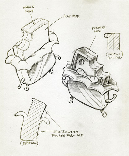
Another project that caught my eye was the Creative Spaces. This project is basically an office space that you can rent out which you may be thinking whats so special about that? however this space is different from any rentable office space i have ever seen. When you think of an office space you think desk, PC chair and a printer thats about you lot but if you see the pictures from this space its like working in a cushy traditional house.
Here are some pictures of the office space:


As you can see from the pictures its a very different kind of office space and its a lot cheaper than most other places. i love the whole old tired look to it as Justine says on the website it has a lot of soul to it and that i can not argue with.
You also get such features as
- The office has a lot of soul
- Being around like-minded people so you will not be on your own going crazy
- free access to a meeting board room when you rent a desk out
- A drinks trolley
- Flexible desk sharing
- On street free parking
- Free WiFi
- Postbox outside
- Greasy spoon cafe, chip shop, and walks along the River Don
How many office spaces do you know that can offer all that at a good price because to be honest i dont know any. This idea really interests me and I think that it is a really good idea that will benefit a lot of people. Again another success for Silent Cities.
After looking into Silent Cities for a while I now thought it would be a good idea to look at some other local charities to see what they are doing to make the community a better place.
The first charity that i am going to look at is called Assit which stands for Asylum Seeker Support Initiative – Short Term.
http://www.assistsheffield.org.uk/
Basically this is a charity that takes in asylum seekers and who have had their support that they was receiving from the government revoked. Assist help the asylum seekers that are sleeping rough, struggling to survive and pregnant.
Assist help by setting up temporary accommodation for asylum seekers. Currently they are looking for volunteers to set up asylum seekers in their own home for a short period of time due to the fact that there is roughly 1000 asylum seekers in sheffield alone and Assist are struggling to help them all.
They also provide car for women that are pregnant or ill/ older people by providing them with free bus passes so that they can travel more freely without walking in pain or discomfort.
Bikes are also available as well so that they can travel to appointments/ meetings to pursue their claim to stay here legally and pursue support from the government.
All donations go towards living costs and basic essentials for the asylum seekers such as food and drink and soup and shampoo etc. Donation money also goes towards travel costs for government meetings if they are not local so the client is still able to attend to try and win government support back.
Assist do not judge much on the fact that the Asylum seekers are not legal their view is that they are not doing anything wrong and that the asylum seekers funding from the government was wrongfully withdrawn without the correct procedure. therefore they are willing to to help them as much as they possibly can win back their funding and put them back on their feet. The main focus of Assist is the older, ill and pregnant majority as they feel that they are at a higher risk and should have support.
Another charity that i am going to look at is a local organization called Sheffield Cat Shelter.


Another charity that i am going to look at is a local organization called Sheffield Cat Shelter.
www.thesheffiledscatsshelter.org
This is a local charity i cam across and as you can probably decipher from the name its for cats. Looking into the charity i have found that it is also a non profit charity just like Silent Cities. The charity has been going strong since 1897.
The charity relays purely on the donations and voluntary help of the public. Basically the cat shelter takes in cats off the street that have been abandoned or abused by their previous owners and give them a safe shelter to recover in.
They then give the cats all the aid they require such as medicines and vaccinations etc and bring them back up to full health before then microchipping them and rehoming them into a loving family.
I personally like this charity as i am an animal lover and i hate to se animals in pain or abused i think the fact that they have managed to stay running all this time with no backing from the government is amazing i am really impressed.
It just goes to show you if you can find a charity that focus's on a topic that a lot of people can relate to our feel strongly for it is possible to grow a successful and well known organization and grow separate pilot companies even to expand the organization like Silent Cities is trying to do.
Here is another Sheffield charity called Sheffield Mind.
www.sheffieldmind.co.uk
Sheffield Mind is a charity that does a variety of different things to aid people suffering from mental health problems. It is a pilot company from the foundation company of National Mind.
It started off with one pilot office and now it has over 200 offices over the Uk which is quite impressive to say it was founded in 1969.
As for what they do they offer such services as:
- Counseling
- Information
- Group Work
- Art therapy group
- Mind and body classes
- Parenting groups
After doing some research and having a good think about what I would like to do I have decided that I am Going to defiantly going to run with the Creative spaces idea. I think that it will be a good project to take on and I already have some ideas buzzing around in my head on what I want to do for it.
Right so basically the brief is to create some sort of promotion for the creative spaces at Clarence Works.
So first things first lets think of who I am going to be aiming the promotion at. As I understand from reading through the brief the creative spaces is aimed at creative people working from home or business start ups trying to get their business off the ground working from home.
Basically then we have got a mixture of different work backgrounds and careers that people will be doing so that means that the promotional outcomes do not want to be specific to certain career types as the creative spaces is aimed at everyone basically.
Now that I know who my audience I can start thinking about how I am going to go about promoting the space and what method would suit the brief the best.
As I want to get the promotional out to quite a big audience I thought the best way and at the same time the most logical way would be to do promotional posters and maybe some direct mail outcomes etc.
These will reach quite a large audience as they are versatile and can be placed anywhere such as billboards, or notice boards, shops, cafes, newspapers etc the possibilities are quite limitless to be honest.
Moving on to ideas the first idea I had was a good idea but unfortunately it was on too much of a big scale to actually be made possible by Silent Cities which Justine agreed. My idea was to combine two of the briefs together to in reality kill two birds with one stone. I was planning on combining the creative spaces brief with the non profit designer brief.
So my idea was basically to get both profit free designers in to Silent Cities and promote the Creative spaces at the same time. I was going to do this by aiming a promotional campaign at post grads and design students that have just finished their course at college or uni of similar to come down to Creative Spaces and create some work for non profit charities etc and the only think they would have to pay was the £50 to use the space and in return they would get their work showed around and gain credit and maybe if land a job through a company that has seen their work. All in all this sounds like a win win situation for me.
I thought that I would go about doing this through Direct mail and Poster outcomes. As it would be aimed at students etc the posters would be up on college and Uni notice boards etc.
Sine it is aimed essentially at the younger generation I thought the best means of promotion would be through social means such as Facebook and BBM and I Phone messenger and such.
As I said my idea did not go much more past this initial concept idea as it was not realistically going to work and was what Justine wanted. Although I did create a couple of mock up designs of a BBM poster and another outcome showing how the poster could look in different environments etc.
Here are my two mock ups below:
BBM Poster.

So basically for the BBM poster it would have been a case of it being presented on a notice board and the poster would show a conversation through the BBM format between Silent Cities and a interested individual. The poster would have the BBM pin on which people with Blackberry phones can then add and communicate with Silent Cities. Also the poster would have the phone number or email address within the conversation on the poster.
BBM Poster mocked up in different environments:

Here is basically a poster showing what my BBM poster could have looked like in a number of different environments and applications etc. So I have shown it in the places such as bus stops, notice boards and direct mail outcomes because i think that is what have been the most suitable for this idea.
As this idea went out of the window it is time to think about doing something else. after looking around at different ideas I thought what might be a good idea is creating a range of direct mail posters that I could do in the style of a swiss typography outcome.
I got the idea from looking at different outcomes for direct mail and poster designs on the internet and in book etc and I came across this poster below:

I really liked this poster from the moment that I saw it I think it is really different and looks the part from the layout down to the colour scheme. After looking at various examples of swiss typography and posters I decided to mock up one of my own to see what it could look like.
Here is my mock up/ attempt at a swiss type poster:

I created it in the same sort of layout as the swiss poster that I have showed above. I think as a mock up its not too bad obviously if I create it properly it would look a lot better than this as this idea was only a rough mock up done in a matter of minutes.
I quite like the idea of creating a series of swiss based posters like this one however after thinking about it my heart was not really in the idea and this made me think that if I did go for this idea I would not be able to get fully into it so after talking to one of my lecturers about it I decided that I was going to leave this idea and look for another idea to go with. My lecturer actually liked this idea but he said if I did not feel it was going to work and show my work the best than do not do it and try something else so thats exactly what I did.
For a while I was absolutely stuck in a hole and I could not figure out what it was that I wanted to do. I Started to get really agitated as I was eager to start and just wanted to get into but as my fellow peers said to me sometimes it is not that easy.
Just when I thought that all hope was lost I was sat in my room watching television with a sketchbook desperately trying to create some ideas when an advertisement caught my eye on the television and "ding" a light bulb came on in my head.
The advert I saw was a chewing gum advert by Wrigley's I believe and it had these cute and likeable little characters in it running around etc. The advert is basically saying get rid of bad breath and all the little characters cute as they are represent factors of bad breathe like coffee and sweets etc.
So I then thought I would create a number of my own characters relating to what you would find in your home whilst you are working and items that they would show factors such as stress and frustration due to being stuck in on your own working from home etc.
I was thinking of the characters having faces etc to make them cute and likeable as characters in adverts, TV and posters are very powerful as they are liked by a large audience so it hits a lot people.
Before I started to create my characters I decided to look into the Wrigley's Characters a little more as these would be the inspiration for my characters.
Wrigley's Gum Advert:
As you can see from the television advertisement it is the little cute characters that make this advert so successful in my opinion. Obviously my characters will not be moving they will be static but the idea of using characters is that they have a very likeable factor about them and also as I will be creating my own set of characters I can then apply them to different ideas and outcomes easily as they will be quite versatile as they will fit into a number of different ideas without looking out of place and if i create a number of characters I can have one on each poster/outcome Ido and they will give my work a nice consistant look and feel.
After looking at the advertisement on the internet I came across some of the original drawings from the advert on someones website so I thought that I would include them on here because I found them really interesting to look at and I liked looking at how the drawings was broken down into parts showing how they could look when made into 3D characters like on the advert.
Wrigley's original Character drawings:


I really do like ll these little characters I think that they work really well and have been thought out well. I like the original sketches and then also the renders are really impressive. I just think it is amazing to look at an advert like the Wrigley's one and then look at the original idea to see how it all started it just interests me so much its kind of like watching behind the scenes of films to see how they achieved certain effects and what the original idea was if that makes sense.
Now that I finally have a heading on where I am going with this project its time to focus on what I am going to do next.
I am thinking of creating around four of my own characters which I will then include on a set of posters/ direct mail outcomes to promote the Creative Space. The character will be the main focal/ selling point of the posters however to make each of my posters complete I am going to include some copy in a nice creative and more importantly suitable font to work along side my drawings to really help finish the posters off and give them a strong look and feel.
I want to try and keep the copy minimal so that it does not over power my drawings. I will look more into the copy when I have got my characters created.
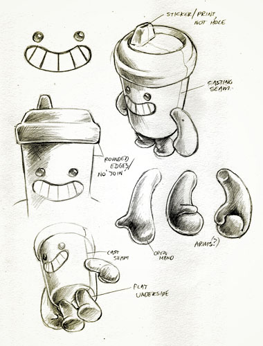
I already have a rough idea of what and how my characters are going to look like however I do not just want to jump straight on to a Mac and start creating them so I am going to create a few sketches so I know exactly how I want my characters to look etc so then I can create them more accurately on the Mac.
I think that I am going to create my final drawings using Adobe Illustrator as I think this is the most sensible and accurate software to create them with. I will create them using the pen tool using my original sketches and ideas as my bearing so I have a reference of what I want them to look like.
As for what household objects they are going to be I was thinking of doing the most common objects you may come across working from home at your desk etc.
So I was thinking of picking a few from the following list of objects:
- Coffee Cup
- Pencil/ Pen Pot
- Stress Toy
- Ruler
- Phone
- Pen
- Paper bin
- computer
- book
- pets
They are just a few objects that people may have around them whilst working from home. I am going to pic a few from the list and try sketching them into different characters. One thing I have to bear in mind is which objects will look cute and more importantly more convincing as a character.
Bearing all of this in mind I set about creating some sketches to potentially turn into my four Characters.
Here is some of my sketches/ Ideas :
Drink Characters

Paper Bin Characters

Objects from home


Objects from home 2

After creating a number of pages of different characters I am happy with how they have come and I am now confident that my idea of using characters will work.
I think out of all my different characters the four I like the most has got to be :
- The Basic paper bin (2nd page, middle drawing)
- The Coffee cup ( 1st page, drawing on the right)
- The Pencil pot (3rd page)
- The Stress toy figure (4th page)
I have chose these because I think they work the best as characters and look rather likeable compared to the rest of my drawings. I also think that when coloured they will look great. I already have a idea on what im going to base my posters on and these four drawings I have chosen will work the best with the theme I am wanting to do.
Moving on to the theme of my four posters. I am wanting to use my characters to show stress and frustration that is manifested working from home this could be through a number of different reasons such as noisy neighbours, children pestering you, same old environment driving you mad or maybe just that fact that you have nobody to talk to etc.
So thats where I am going to bring my characters in. I am hoping to use my characters in a fun sort of way to show these emotions and have the appropriate copy as well to get the message across.
For example I was thinking of having the waste paper bin on one poster filled with paper to the point where it is overflowing so its showing that the person working from home is stressed and can not seem to do anything right hence the full bin, because of this the bin will have a sad expression on its face and the copy may be something along the lines of " Empty your bin and fill your mind at Creative Spaces" Just a line of the top of my head but you can get the idea of what I am going for.
Another example would be to have on one of the posters my pencil pot drawing with one of the pencils on the desk snapped in half showing that the person working from home can not think straight and is getting frustrated etc so the pencil pot would then have a sad expression on its face or a sad and shocked expression as one of its pencils has been snapped in half and then the copy to go above would again relate to the image so it would be something along the lines of " Sharpen your thinking at Creative Spaces" or something simular
The message lines like I have just exampled would be in a big font and would be short and snappy and then underneath in a smaller font would be something selling the Creative Spaces such as " Cheap and affordable office spaces from as little as £50 a week". Thats my idea so far anyway.
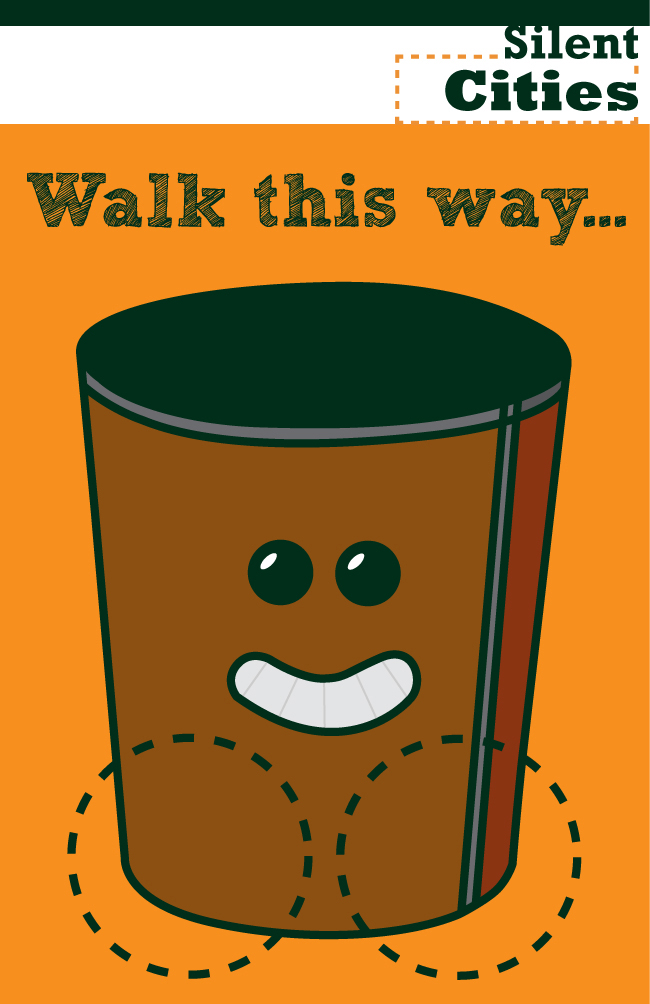
Moving on I thought that I would take my four drawings and bring them to live using Adobe Illustrator Here the finished characters:
Paper Bin:

Stress Toy:

Coffee Cup:

Pencil Pot:

I am very happy with how my drawings have turned out. They may need a little tweaking later on maybe but first off I want to get the size and positioning of them right and also the poster design and colours etc so if they need any work I will do it later on as fine tuning but at the moment I am pleased with them also because I have drawn them myself I can change their expressions and size and colour all very easily so if i change my mind on something on them they can be tweaked and moved about with ease which I think is a good point.
Now that I have my characters done I am going to move on to my next two aspects of the brief which are to create the actual layout of the poster/s and then also I need to re make the Silent Cities Logo as the original is really small and I have not been given a high resolution copy from Silent Cities.
However Justine has provided me with all the colour codes used for her colour schemes and logo and also a font to be used for the logo so it should not be too bad.
I think for my layout i want to stick with the bright orange colour scheme which is becoming the signature colour for Silent Cities. I think that I am going to have the orange as the main background colour which will give the poster a real bright and vibrant look and feel to it and then I think I may include some sort of white Banner across the top or maybe bottom of the poster and include the Silent Cities logo within that band which should help contrast against the organe background and really bring out the logo.
Right I have a rough idea in my head now of how I roughly want the layout to look like so I am going to quickly mock up a poster just so I can get a feel for it etc.
Heres my mock up layout design:

I like the look of the layout so far. This will act as the template for each one of my posters and on each poster the character and copy will change to something different. The box at the bottom in the light brown colour will represent a desk in which all of my characters will stand on.
The colours on the layout are not accurate I would just like to point that out it is just a mock up but for my final layout I will be using the colour references given to me by Justine.
Also the Silent Cities logo has just been pulled from the web so I will be re creating it myself to a higher resolution for the final posters.
Like I said earlier this is just a mock up but the actual look of the layout it what I am wanting to for it just needs a bit of fine tweaking to get it to what I want.
Right now that I know what I want my layout to look like to a point I have placed my characters on it to get a feel of what my posters are going to look like.
Below are a sort of preview of my posters/direct mails:
Paper Bin Poster:

Stress Toy Poster:

Coffee Cup Poster:
Pencil Pot Poster:

So there you have my four poster outcomes. I am liking the look of them so far and I think that with the right copy and font on them they will look the part. I think the drawings make the posters in my opinion but the copy is what will pull them all together.
They will all need some slight tweaking but at the moment they are what I am going to be aiming for. As well as having these as A3 posters and maybe a smaller scale for direct mail outcomes I was thinking I could also have some business cards with my characters on for the creative spaces.
These could be distributed to different charities by Justine and could also be in a small holder at the site of creative spaces so that people that are using the office space can take one and give it to a friend or college that is interested in renting a space.
The cards would have the characters on so I was thinking of having around 4 cards one for each of my characters. The layout would be the same as on the posters to show consistency in my design and also to show people that the posters and cards are linked to the same thing.
I am going to mock up these cards so that I can show them to Justine and Paul Ward when they come to visit my college for our second meeting to see how we are progressing. Then depending on the feedback I receive for them will determine wether I continue to tweak the designs and make them into a final outcome as well as my posters.
Here is my Creative Space business Cards (Mock Ups) :
Paper Bin Card:

Stress Toy Card:

Coffee Cup Card:

Pencil Pot Card:

Back of Card:

Like I said above these are only mock ups and the copy and font may well change later on I just wanted the to get the visuals right so that I could show at my second meeting with Justine and Paul what ?I am wanting to create etc.
I think as visuals they work quite well. I think that if Justine and Paul like the idea once I have got the right colours in place and the suitable font and copy these should work even better and look more professional and clean cut.
After I had created this set of business cards for Creative Spaces I was looking around on the internet and came across an interesting business card that I could use or at least use part of the original idea in my own way to make my own unique business card.
Here is the image that caught my eye:

I found this image whilst I was looking for possible layout ideas for my business cards if I was to use a different layout to what I had used on my poster designs. When I cam across this I did not think much of it I just thought it was a good idea it looks like the persons legs are touching her head being "flexible" and that goes with the copy which all works great but then I was looking at one of my characters and then it hit me.
I could create a set of business cards simular to this one but using my characters. So you could have the character on the front and you would have two finger holes that would match up as the characters legs and then you could have the copy and info on the back.
The copy could be something along the lines of "move in to Creative Spaces" and the idea would be you would put your fingers through the holes to make your own finger puppet walk, this would then relate tot eh copy on the back of the card which I think this could work well and its a little different to your everyday business cards.
So after having spent a while on Adobe Illustrator modifying my characters slightly this is roughly what my idea would look like as a business card set.
Paper Bin Card:

Stress Toy Card:

Coffee Cup Card:

Pencil Pot Card:

Back of Card:

I am really pleased with how these visuals have turned out I think that they look really different. If Justine and Paul like them I think that I will obviously fine tune the idea but I might even make one for real with the cut outs just to show how the business card would work etc.
So far in this project I am happy with the amount of work I have done so far and I think my ideas are relativity strong and has the potential to work well.
In a few days Justine and Paul are coming in to look at our ideas and work so I am going to concentrate now on getting all of my work and ideas on to a Pdf document and create some notes so that I know exactly what I am going to say to them and make sure that I get all of my ideas across.
Summary of meeting:
The meeting I thought went quite well. I opted to go second to show my work for the simple reason I was nervous and wanted to get it out of the way straight away and also I did not want to forget what I was going to say.
I am glad to say that my presentation went better than expected if I am honest and to my surprise I did not receive any bad feedback from Justine or Paul. However they did give me a few pointers and ideas on my work and what I could do to get the full potential out of project etc which I am really grateful for.
One the whole they both liked my idea and where it was going and Justine loved my idea for the finger puppet business cards so I am defiantly going to pursue that idea. They both liked the idea of my using illustrated characters especially the fact that I created them myself.
I have took in all the advice and ideas that they have gave me and I intend to put them into action and include what they have said into my work. I had my notebook ready on the desk so that after the presentation I could make notes of the feedback given to me so I could use it as a reference to continue with my project and make it better.
The main advice and ideas that was put forward was the following:
- Maybe make the characters a little more contrasting like having a CD player on the working from home poster and then have a happy Vinyl Deck on the Creative Spaces poster or simular.
- Go a little more viral with it so have your characters as maybe beermats in pubs etc try to aim at where possible tenants will be.
- Could make the finger puppet business cards for tenants about to move in.
- Silent Cities logo needs to be bigger.
- re design logo so that it is of better quality.
- Maybe have the Silent Cities reversed out of say black? something to contrast it more and lift it.
overall I am very happy with the advice that I have been given and some of the points that was put forward I already had on my to do list such as the size and quality of the Silent Cities logo etc but the other points was really helpful.
I like the idea of going a little more viral with the characters by having them on beermats etc and I also like the idea of maybe including a little black into the colour scheme.
I am not too sure on the whole idea of having new and old posters as I think the idea will only work for one or two posters and not for the full set so I am going to try and find way to maybe change my posters slightly to make them a little different but I do not think that I am going to go with the old and new pictures I can see where Paul was coming from and its a good view point on my idea but personally I dont think it will work in this situation.
Moving on, now that I have got all the ammunition I needed of Paul and Justine and have been given the green light for my idea it is time that I plough forward and start tweaking and finalising all my ideas and making them into pristine finals.
First things first I am going to re design the Silent Cities logo well when I say re design I mean replicate it in a higher resolution.
The main font used for the logo is Memphis however Justine was unable to provide us with the correct font but our lecturer pointed out that Rockwell font is almost the same in every way so I am going to use that font just as some of my peers have.
So after spending some time on Illustrator I have managed to re make the logo here is the comparison to the original below:

My logo is obviously on the bottom it only has a few minor differences and that is purely due to not being able to use the correct font but apart from that it is more a less identical to the original and is at a high resolution for print.
Right, my next task is to get my layouts all sorted colour wise using the correct Silent Cities colours where appropriate and maybe tweak them slightly. Also I need to re position my logo at the bigger size requested by Paul and Justine and maybe experiment with adding a little black into the mix.
After creating my new poster layouts from scratch based on my original idea here are the outcomes below for my final layouts:
Paper Bin Poster:

Stress Toy Poster:

Coffee Cup Poster:

Pencil Pot Poster:

I am glad to say that I am happy with my new tweaked layout. I have took in the advice given to me by Paul and Justine so my new layout boasts a larger Silent Cities logo and I have added a little black into the mix which I must say I was a little unsure about but I think its turned out well and just gives it that finishing touch. I did not want to go over the top with the layout and I also did not want to stray away from my original idea too much as I liked it.
I think the new layout has balanced out good as it still shows my original idea but also now has become more refined and looks more professional in my personal opinion.
The Next aspect I am going to look into now is the copy for each of my posters and also select a font which I think will suite the posters and fit in nicely along side the illustrations.
I already have two fonts that I want to use on my posters which I downloaded earlier for this brief. However I am not sure which one that I want to use yet so I have made two sets so that I can compare and I am going to ask my lecturer Paul his advice when I am next in college. I have got all my copy sorted as I have already spoken to Paul about what I was going to put on my Posters so I have applied all the copy and I am going to ask my peers and lecturers what their opinions are when I am next in college.
Here is the first set using a font called Sketchy Rockwell :
Paper Bin Poster sketch style:

Stress Toy Poster sketch style:

Coffee Cup Poster sketch style:

Pencil Pot Poster sketch style:

I think this set looks good and I think the font really sets them off. The font as I said earlier is a sketch version of Rockwell. I think its funny because I am not that fond of the original Rockwell font however when I came across this sketch re make of it I knew it would suit my posters and theme perfectly and in my opinion I think it looks the part. I prefer this set a little more than my second set however I like my second set because it looks a bit different.
Take a look for yourself. Here is my second set using a different font called Phorssa which gives off a kind of abstract cut out newspaper feel in my opinion:
Paper Bin Poster cutout style:

Stress Toy Poster cutout style:

Coffee Cup Poster cut out style:

Pencil Pot Poster cutout style:

I really like both of the two sets however although I am swaying quite a lot to the first set I do like the second set and it is growing on me quite a lot. However I think that the first set looks good visually but is also very clear legibility wise where as the second set also looks good visually but you have to look harder to see what it says which is why I am put off it more.
On saying that though the flip side of it is that these posters would be mainly A3 so the text would be big so they both will be easy to see but if I also make these into direct mail flyers that are A5 size the second set may not be all that clear to read. Just for them reasons alone I am swaying towards the first set but I will still ask my peers and lecturers opinons as I would like to hear their feedback.
Now that my final posters are sorted and its just a case of selecting a font and maybe some slight fine tuning when I return to college I am going to push forward on to the business cards.
Out of the two sets Paul and Justine preferred the second set as they said it would be a good idea for tenants that are moving in etc so I am going to finalise them using the same colour scheme and simular layout as my posters however I think If I have time I will create the 1st business card set I created so that Justine could distribute them to people interested in the Creative Spaces or for people that are already using the Creative Spaces and want to give one to someone they know who may be looking for a office space.
Here is my new set of finger puppet business cards:
Paper Bin finger puppet:
Stress Toy finger puppet:

Coffee Cup finger puppet:

Pencil Pot finger puppet:

Back of Puppet cards:

The finger puppet card set was quite challenging to and there was a lot of trial and error involved in making them mostly error's but I managed to sort everything out and I am pleased with the outcomes.
The first problem I had was not all of my characters fitted the way I wanted to position them on the cards so I had to tweak and change the overall shape of them to get them to fit. I also had to move their faces around quite a lot and get all the angles right and make sure everything was centred correctly.
This took quite a lot of messing around but I managed to overcome it thankfully. I have stuck with the same font as used on my posters so it keeps these relevant and includes them in the theme.
Originally these was just going to be cards that people could pick up in the Creative Space offices are if Justine was to distribute them out. However I then had a talk to Justine and found out a little more on how the Creative Spaces works.I found out that when you rent a space you are given your own key so that you can come in when ever you want between the opening and closing times as this gives it a more homey feeling. So then I thought of the perfect use for my puppet cards these would be used when someone has rented an office space at Creative Spaces in a sense that you as the tenant would receive this via post and then you would take this with you as a sort of creative proof along with your ID maybe or a cover letter that could be sent with this. You would then get the key and get to keep the card.
After completing my finger puppet card set I thought I would go on and re design my original business card set as I have enough time to do it and Justine and Paul did like the idea they just preferred the finger puppet card set but I thought since I have the time why not create both as it will help keep the theme alive with my puppet cards and my posters.
Below I have included my final designs for the Creative Spaces business cards:
Paper Bin (front):

Paper Bin (back):

Stress Toy (front):

Stress Toy (back):

Coffee Cup (front):

Coffee Cup (back):

Pencil Pot (front):

Pencil Pot (back):

As you can see I have kept all my layouts consistant throughout my final outcomes and these business cards are no different.
I wanted to change my business cards a little from my original set as they seemed a little plain and bland. So I thought that obviously I would apply my new layout to spice it up a bit but the main idea I had was to have on the front of the cards one of my characters with some copy saying "Creative Spaces.." with leader dots and then when you flip the card the back would have a part of the original copy from the character posters, Sounds confusing when I say it like.
For example on the pencil pot poster the copy was "Sharpen your thinking at Creative Works" so on my pencil pot business card following on from the "Creative Spaces.." on the front I then have put a segment of copy from the pencil pot poster on the reverse of the card which is "...Sharpen your thinking.
I think this works well on all of the cards and gives them a little more life and also gives you a reason to turn them over and look on the back to find out what leads on from the front. I also created a simple but in my opinion effective dashed box around my copy which links to the logo and isolates the text from the rest of the card which makes it stand out more in my opinion.
Now that I have completed all of my original ideas for this brief I am now going to create some extra final designs that was suggested to me at my presentation with Justine and Paul.
So the last things I need to design is:
- A range of key rings.
- Beer mats/ coasters.
As I already have all my characters created and finalised it should not take me that long to create a set f key rings and a set of beer mats/ coasters.
The first set I am going to create will the key rings. For this I am going to tweak my characters slightly and make them into key rings and show a key attached to them to show what they would look like.
Here is my set of character key rings:

Obviously I can not actually make the key rings of my characters so instead I have shown what they would look like and I have presented them on an A3 page using my layout. I think that the key rings would work well and the idea would be that you could either buy one of the key rings off the Silent Cities website or you got one free when you make a donation to the charity. I thought that if you was a tenant of Creative Spaces you would recieve one of these for free along with the key to your office space.
My next step is to create a final design for some beer mats/ coasters promoting Creative Spaces/ Silent Cities using my characters.
Here is my set of beer mat/ coaster final designs:

I am really pleased with how my set of beer mats/ coasters turned out. The idea is that you would have four of them per table and each one is numbered 1 to 4. You read them in number order and each one gives you some information on the office space and they all have the Silent Cities logo and email address on so if they get parted people can still contact out what its all about.
I have chosen to go for the Silent Cities own yellow to make mt set stand out from the crowd as there are a lot of different sets about now days and I did not want mine to blend into the rest. The yellow really catches your eye as it is really bright and vibrant. In my opinion it draws you in perfectly.
On the back I have gone for a black and Silent orange theme with white font. I have also coloured in the numbers of the mats in Silent Pink so that they can be easily identified.
I have included a little text box at the side of each mat explaining the different stages of the set.
I must say on the whole I am really happy with how these have turned out and they will be a great way to spread awareness of Silent Cities and more importantly Creative Spaces.
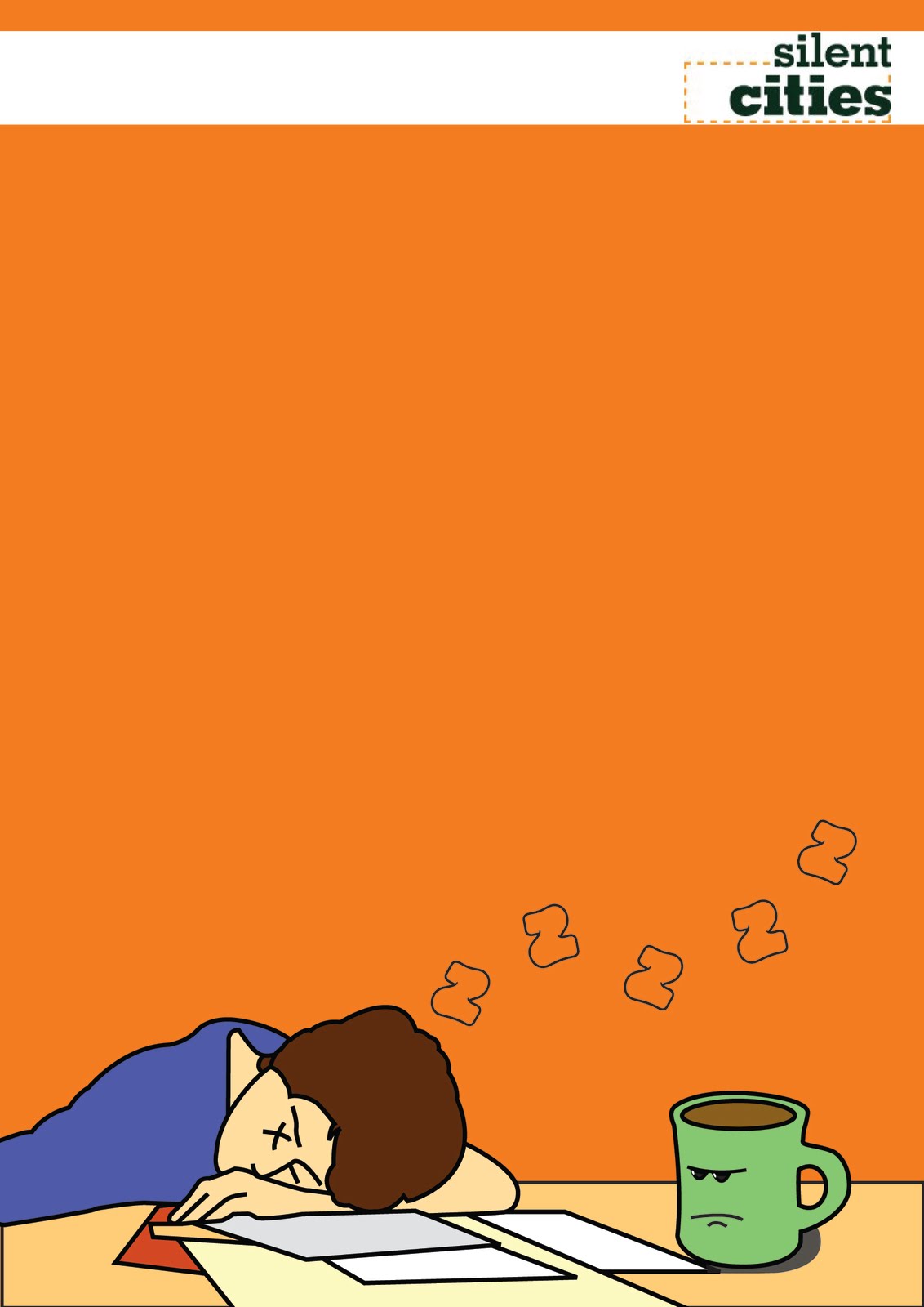
Finally to finish of the design work of this project I am going to create a poster for Creative Spaces itself showing all the four characters and include some copy saying something along the lines of thank you and welcome. I will have all the characters off my final posters smiling to show they are now happy as their owner is no longer stressed,bored, frustrated etc but is now calm and has a office space at Silent Cities.
After a bit of dabbling in the Adobe Suite here is my welcome poster:

This poster would be mounted in the main entrance of Creative Spaces just as you walk in. As I want people to notice it as soon as they come in I think that it would be presented to an A1 size maybe or possibly A2 depending on how much wall space is available.
As you can see all the characters are happy and are all smiling which creates quite a nice cute image in my opinion and I think it would be a nice image to see as soon as you arrive at Creative Spaces.
Also by having this image up people who have seen the posters, business cards or beer mats but have never actually been to the Creative Spaces offices will be able to realise they have found the right place as the welcome image links to all my other design work relating to Creative Spaces.
End Evaluation
I must say at the start of this project I really could not get into it and I was not looking forward to progressing through it however after a few weeks of brainstorming and trying different ideas out I finally found an idea that I knew had some great potential.
Once I had started with my whole character themed idea I really got into this brief and went in full throttle. I have hit a few ditches on the way such as colour problems and not knowing what copy to go for and even the creating and editing of the characters themselves but thats life I suppose. Every little ditch I have fallen in I have assed the problem and fixed it and kept moving forward.
I think on the whole this project has been great and I am really happy that I got produce design work for a local charity and also a well known successful graphic design firm. It has opened my eyes a lot and after having presentations and professional briefing-in meetings with the clients it has gave me an idea of what its like as a designer in the real world working for industry which hopefully soon I will be in.
By having presentations and crits with the clients it has also made me realise that in the real world of design you have to pay very close attention to what the clients needs are and it is not like a college brief where you can stray away from the guidelines and do what you think is best. On this brief I have found that the client comes first and you have to take on board what they want and then you have to work your designs around the idea that they have given you and even if what your creating is not to your style if the client wants it like that then that is what you must produce.
I am happy with how my ideas and work have evolved throughout this brief and I do not think if I was to do it again I would change many aspects of my work. I have took on board all the comments and advice given to me by Justine and Paul and like I said previously I have managed to keep my original idea but tailor it to exactly what the need of the clients were.
As far as college briefs go this has got to be one of my favourites and most challenging and I could not have really asked for a better final major project as I feel I have got so much out of it.