Also I must come up with a direct mail pack to promote the new YO! Sushi bar, a new branded menu with my own style and a wine/ beer label.
The most important aspect that I need to keep in mind is that the theme and style I choose for my mural doesn't over power the Yo! Sushi brand. For example if i choose a Banksy theme for my mural I would have to create it in a way that people who saw my mural would know it was for Yo! Sushi and not "Oh look a Banksy restaurant".
I am quite looking forward to getting stuck into this brief and I already have a couple of styles in mind that could work well. I am undecided at the moment as to which style in particular I am going to go for eg. illustration, vector, photo manipulation etc but I am thinking of a sort of Graffiti / urban theme. I think that a sort of theme like that could really work well created in the correct way of course.
For anyone who is not familiar with Yo! Sushi or has never heard of it for example one of my lecturers, Mike!
It is a fast paced on the go style restaurant that serves the obvious sushi but also a wide range of popular food from the urban Tokyo scene such as traditional soups, noodle dishes, salads, Chicken Katsu Curry, Salmon Teriyaki and lots more.
Yo! Sushi was founded in 1997 after improving on a conveyor belt food serving system used by a Japanese ‘kaiten’ sushi bar in Japan. The Yo! Sushi brand decided to not only improve the idea but also wanted to take it up a level and open sushi bars in other countries around the world to show how healthy and delicious sushi was in countries that did not really sell it.
Yo! Sushi opened their first UK based branch in London and since then the company has spread all over the world internationally. One of their newest branches to open is in Meadowhall in Sheffield. In my honest opinion I am not the biggest fan of the food that Yo! Sushi specialize in however I like the whole idea of the conveyor belt food serving system as I have never seen that anywhere else before its really quite an innovative idea. I also like the look and feel of the company the colors and styles used are very vibrant and modern this gives the company a really urban and interesting look in my opinion. I don't really want to go into anymore detail on the company as it is an international company and I am aware that most people know whats it all about so I don't want to create a long and boring report on it as it is not needed to be honest.
However if you want to know more of the ins and outs of the Yo! Sushi name and the story behind it here is the link to their website.
http://www.yosushi.com/
After looking around on the internet I came across a link that led me to a site Called YO! Company. What I found next was quite interesting. It turns out that YO! Sushi is just a link and a rather large chain of sister companies owned by a company called YO! Company or ( YO! Co). Thats where the YO! in YO! Sushi has come from. Now I know this the YO! Sushi name makes more sense to me as I originally thought it was just a quirky name given to a sushi bar but now I know that YO! is the mother company and the Sushi is just a addition to the YO! Company which I did not know before.
Also the YO! Co has quite a long list of other companies and businesses under the YO! umbrella including :
- YO!Tel (Hotel)
- YO!Japan (Clothing line)
- RadiYO! (Radio Station)
- YO! How? + Simon Woodroffe ( website with all the information on Simon Woodroffe, Founder of YO! Sushi)
- YO! Zone (Spa / Social place, currently in development)
- YO!Home (Currently in development, a concept of your own branded house designed by YO! HOME company)
- YO! Everything (Basically a site open to your own personal opinions and suggestions on what the YO! company should create next)
http://www.yocompany.biz/index.html
Now that I have explained a little about the company so you get the jist of it I am now just going to look a little into how the different Yo! Sushi bars are set out and designed as they are all individually designed to look different.
Right the first thing I am going to do is look a little into the Yo! Sushi company to get a better understanding of what the company is all about and how the look and feel of each Branch/ Restaurant differs in design etc.

I also had a good poke around on their website too and I think the vibrant feel from the YO! Sushi logo itself is reflected throughout their site. Everything is really colorful and bright. In actual fact its probably one of the colorful and vibrant sites I have visited. I think it is very fit for purpose as its very hip, very now and modern which when I was reading the "about us" section on the site that is the sort of aim they said they was going for a kind of modern feel in fact the quote was "YO! Sushi was a brand new concept in dining and catapulted Londoners into the 21st century which made us the most talked about dining experience. Our customers queued around the block as we gave the capital a slice of Urban Tokyo" Below is an image of my local YO! Sushi in Meadowhall Its as if the UK along with the rest of the world was kind of living in the past and YO! Sushi wanted to shunt us all forward into a new way of dining and a different concept of food to which we used to. I think the way they have gone about it with the funky styles and bright colors and the whole overall attitude has paid off. Well they must be doing something right with opening another two YO! Sushi bars in London and I have also witnessed how popular my local YO! Sushi bar is in Sheffield its always crawling with customers most of the younger generation which is interesting.

The YO! Sushi logo itself is displayed similar to the first image I included in this blog. Again it has been mounted on a bright orange three dimensional cube with the brand name printed on each face of the cube. To make it a little more interesting the cubes also spin around so no matter what angle your looking at it from you will always be able to see the name which is important.
Below is another YO! Sushi bar this time from Dubai.

As you can see from the image the layout of the bar is completely different to the Sheffield layout in more a less everyday possible. The lights for one are unique the color and texture of the surfaces are different and also this particular YO! Sushi bar is set out more like a traditional restaurant would be in comparison to the Sheffield bar that was set out more as a quick food stop and then off out again.

Below is the View from the Gateshead YO! Sushi. This time the layout is more open again like the bar in Sheffield. It has been created in an oval shape kind which gives it a nice smooth look. The YO Sushi! name is displayed in the same context as the other two bars I have looked at so I am going to say that's the only aspect that must keep consistent which makes sense I suppose because when you look at other food chain restaurants such as McDonald's and KFC nine times out of ten their logo is displayed or mounted the same way throughout so that the restaurant is instantly recognizable.
Back to the YO! Sushi at Gateshead they have gone for a more screen based approach with curved screens displaying what looks like items off the menu. Also four flat television screens are displaying information that is relevant to the consumer. Out of the other YO! Sushi bars I have looked at so far this one seems least creative and interesting if anything its more on the boring side and just looks like a regular quick stop food place where as the other two YO! Sushi bars I have looked at have a more funky theme going on.

The last YO! Sushi bar I am going to look at is the Dublin bar as seen below.

For a start I love the layout of this particular bar as it is really different and in my opinion just screams out modern. Again nice vibrant colors used. This one is set out more like the one in Dubai as more like a traditional restaurant.I noticed flicking through some pictures that the Dublin bar also has a mural. If you look at the image below you can just make out half of the mural. Unfortunately I could not find an image with the full mural on which was a shame.

As you can sort of see from the image the mural is at the left side at first I thought it was themed to Dublin but after having a closer look it is not. It in fact has a traditional Japanese theme to it with Japanese people and if you look closely in the background there is some traditional Japanese architecture. This mural obviously works with the whole Japanese theme as that's where the company has originated from. However I think it would look better if it did relate to city like my mural will. I also like the Japanese sort of flag lines in the background the two tone red works well and looks very different makes a change from seeing the pattern in the traditional red and white scheme.
Now I have gathered a general understanding about what YO! Sushi is all about etc I think it is time to move on to what City I am going to create my mural for.
New York is one of the cities that I have to choose from however in my opinion it seems the obvious choice and I don't want to really sway towards it because I know quite a few of my peers will go for it and there is only so many different ways you can show off yellow cabs and the Empire State Building.
I want to do a city that I don't know to much about to be honest that way I think it will work out better because I will have to look into that city and research into it more than what I would if I was doing New York for example.
looking through the list on my brief I would say the city that interests me most is Paris. I think Paris could be a good choice since I don't really know a lot about Paris apart from the Eiffel Tower and snails that's about as far as it goes for me. Which is good for the simple reason It wont let the obvious cliche's take over my mural where they would if I did New York as it has too many cliches and I think it would over dominate my mural.
I mean don't get me wrong what ever city I choose there's always going to be the odd cliche reflected in my mural but in a way there needs to be a few otherwise nobody what figure out what city the mural was representing am I right?
After quite a long period of thinking I have decided to select Paris as my capital. I think that it has some good potential and I already have a good idea for what theme I am wanting to create and I think if done in the right way it could really work.
Before I start looking into my chosen theme I thought it would be best if I looked a little into Paris itself first to give some ideas as to what I am going to include on my mural etc.
I thought the first thing I would do is create a top of the mind list of items that I personally would associate with Paris so here we go:
- Frogs
- Snails
- Eurostar
- Channel Tunnel
- Effel Tower
- Stripey Clothing
- Moustaches
- Red, white and Blue
- Renault
- Citroen
- Peagout
- Arc de Triomphe
- Villa Savoye
- Parigi.Notre Dame
- Musee D'Art Moderne
- Disney Land Paris
- Wine
To be honest that's about it really Below I have included some images of the points above just for my own reference really so I can quickly refer to them when I am creating my mural.


Hopefully I am going to try and include most of these aspects of Paris into my mural maybe not all of them but I want to get a good mixture of them included in my final piece.
Moving on now I know what city I am going to choose and also now I have got some rather good content to be included in my mural now its time for me to select a theme/ style for my mural.
I have had an idea in my head from near the start of the project and I was just trying to think which city would match it best and would work with. I want to go with a kind of urban street graffiti style. The reason behind this is for one this sort of style is of great interest to me and has been for as long as I can remember but most importantly since the brief states that the design is a radical new direction for YO! Sushi I thought it would work well done in the right way as it is a different kind of style.
I want to create a kind of unusual theme not just the graffiti style as in spray paint on a wall sort of typography style but more of a cartoon / graffiti style characters and illustrations of the aspects of Paris listed above. I think this will work well I just need to figure out how I am going to create it I was thinking I could draw the characters and other aspects myself and then edit them on Illustrator etc. Or on the other hand I was thinking would it be better and easier to create the it all on Illustrator?
At the moment I am thinking that it may give it a more urban feel if I actually draw it myself and then edit them on the computer because it is supposed to be a urban/ graffiti theme and if I created it by hand I think it would give it a more genuine look to it which on the whole I think would work better but I think I will have a word with one of my lecturers before I dive into anything to see what there opinions are like.
I have been looking at several urban illustrators and Graffiti artists in particular as I adore their style it is the sort of style that is shown in their work that I am hoping to create in my own unique way.
One of the graffiti artists work that has influenced me has been Kid Acne.
Here is some examples of his work that I find interesting:


As you can see from the images of his work above he has a very nice illustrated style in my opinion his crudely drawn style works amazingly well in my own view. He has also done quite a lot of his work around Sheffield city center like the "its too late now" piece. Kid Acne is a Sheffield artist, this is one of the main reasons why I thought his sort of style would work well in Paris as nobody will really know him over there and so the style would not over shadow the YO! Sushi name. The last image is sort of the style I want to go for little random characters and quite a lot of them but obviously I would relate them somehow to Paris so it worked.
However as much as I love the work of Kid Acne I want my mural to have a little depth into it. By this I mean that I want to include more than just one artists influenced style. Usually I would not do this but I think in this situation it will work because the other artists I have been looking at are all filtered into the same sort of style and genre they are all graffiti/ urban artists the only difference between them is they all have their own unique style so I thought if I blended and merged some of the different styles together in my own way it would give the mural a sense of depth and a more unique feel about it.
Another artist that I have looked into is a guy called Mysterious Al.
To be quite honest I was not really aware of this artist until about a year ago when I bought some Addidas trainers with his design on. The trainers themselves was quite plain but with his artwork draped over them I could not resist buying them. So you could say I did not really buy the trainers for the make but more for the design of them as they was different from anything I had ever seen before and to this day I have only seen on other person wearing the same pair. Which gives a kind of unique feeling about them in my opinion and I like the fact that not a lot of people have them.
Anyway moving on I decided to visit his website after seeing the artists name in the sole of my trainer in pursuit of more of his work. After looking through his website here is some of his work which really works for me.

The image above is exact same pair of trainers that I bought. As you can see he also has a very urban feel about his work. I think one of the main aspects that makes these trainers work so well is the color selection. I think that the bright green and off yellow work superbly together and when laid on top of the gun metal Grey base really creates a strong contrast in color. My favorite part of the trainer has to be the illustrations on the tongue and also inside the shoe which is covered to every centimeter by a graffiti style of different characters.

Above is an image showing Mysterious Al in action creating one of his character based illustrations on a wall using what looks like large nibbed marker pen. I love the whole thick bold line structure to his characters it really makes them stand out a lot. To be honest I just love every aspect of his style its just epic!

This particular image above is what he created for the Volvo advertisement for the Volvo C30 which was based on a hate it or love it theme. For the footage he created a 133 foot long mural showing off his work. In my opinion it looks amazing and I think it suited the advertisement well because it is a kind of hate it or love it style not just Mysterious Al's style but the whole urban/ graffiti style in general. However I think it appeals more to the younger generation aged 16- 40 that's just in my opinion but in my opinion also its that sort of age bracket that YO! Sushi attract. As every time I walk past the meadow hall YO! Sushi bar its always thriving with the younger generation and there is rarely anybody of the age of like 40/ 45 upwards. So i think that by me choosing a style like this it will work well and will comply with the needs of YO! Sushi.
I also looked at another type of of artwork however the only problem being I could not find out who created it.The artwork I was looking at was the cover to a game that I have called DJ Hero the cover is basically filled with loads of little cartoon character sort of stickers and it is the sort of theme that I really like. I looked on the box itself as well as the instructions and on the internet and could not find an artist name the only information I could find that the game itself was created by Activision so I can only presume that it was them that came up with the cover and not an individual artist. If anyone reading this knows who the artist is than please let me know as I would be interested to look into his or her work further.
Here is the cover of my game DJ Hero:

As you can see it is very similar to the style of Kid Acne and also Mysterious AL. This is why I want to include something similar to this in my mural and come up with a real unique urban style.
I must say I was not to phased when we was given this brief but now I know what I doing and what I am wanting to create I am really getting into and cant wait to push forward and make a start on putting together some rough visuals and possible ideas for my mural.
After I had finished looking at all my influential artists I started with my own drawings. My drawings are a mixture of what I have been looking at but recreated in my own style. In order to start my drawings and get the look I wanted I had to buy some materials. These materials consisted of a graffiti grade A3 sketchpad, an paint marker for the thicker lines and black shading and also a sharpie thin nip marker for the main drawing and outlines. All together it came to around £23 but It was money well spend in my opinion here is an image showing what I bought below, I bought it all from a site called fatbuddhastore.com really useful site.


While I was there I also bought a T-Shirt as you can see from the picture this is not related just included it because I thought it looked rather cool.
Now that I had everything I needed to make a start on my drawings the sensible thing to do was, start on my drawings so here they are. I have included all the drawings I created I am probably not going to use all of them as there are quite a lot but I thought the more I create the more of a broader section I get to pick from.


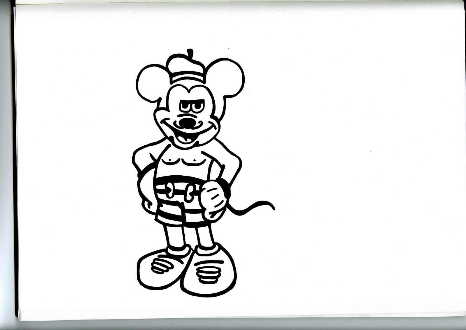


A couple of the images would not upload for some reason another reason why I "Love" using blogger. Moving on, after I had finished drawing all of my images. I then decided on which ones I was going to use etc. I am happy on how my drawings have come out I know they look a little basic at the moment but the next thing I need to do to them is add color etc which will in turn liven them up a little and give them a more graffiti look to them.
After a lot of time and effort spend scanning and coloring the images in an editing them in Photoshop and Illustrator I finally got all of my images colored and ready for placement on my final mural for YO! Sushi. I colored the drawings in by using mainly the polygon lasso tool and also the magic wand tool and if those methods did not work I sometimes had to color by hand which took up quite a lot of time but looked good once I had finished. Below I have included my drawings after I had added color and the relevant editing to them. As always comments and opinions quite welcome.

French Artist.
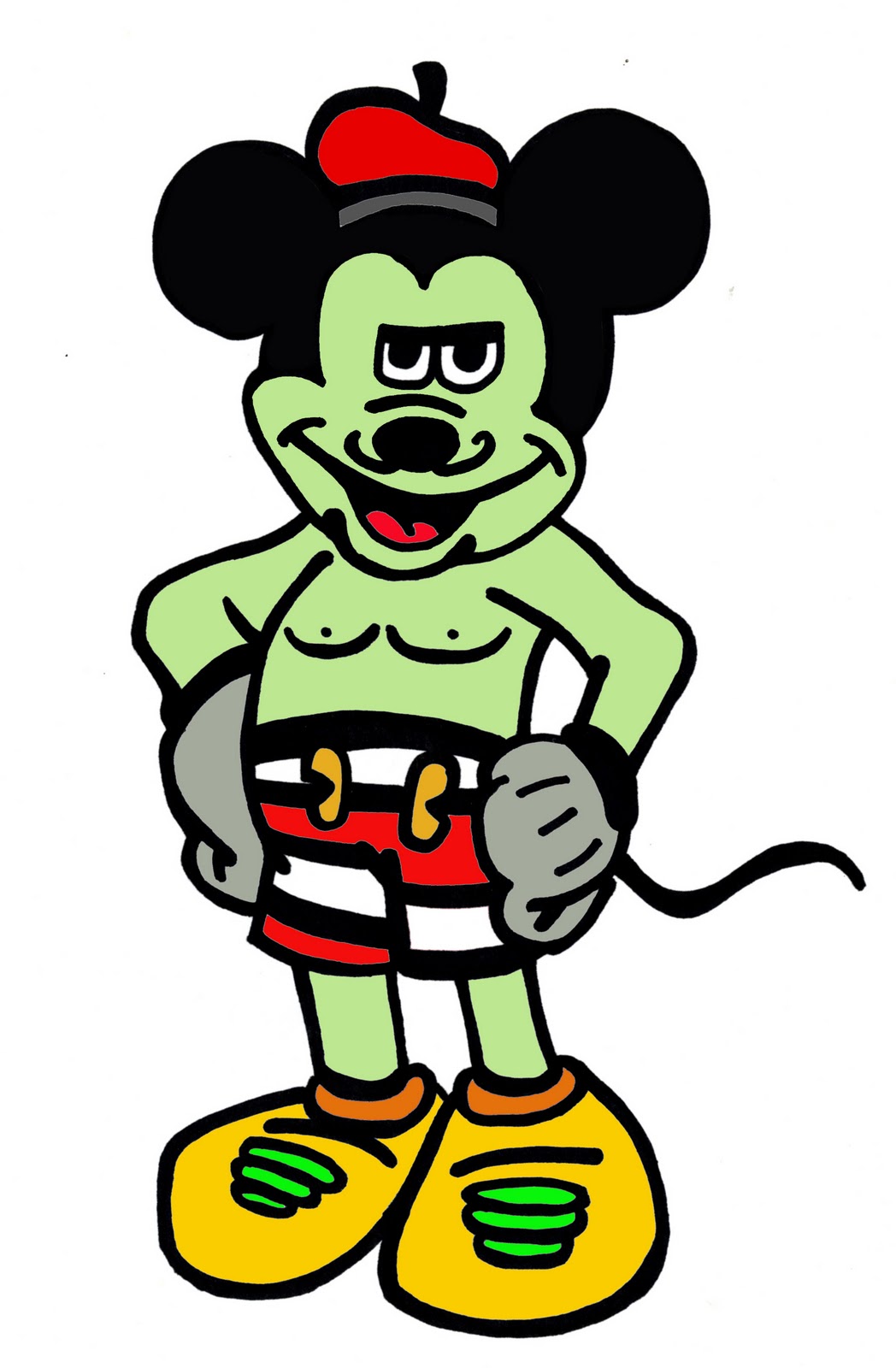
French themed Mickey Mouse ( Disneyland Paris).

French Poodle.

Frog with Fly.

Le Arc De Triumph.

French man holding flag.

Mona Lisa.

Different characters and YO! Sushi in graffitti.

Urban themed Snail.

Eurostar Paris train.
I have to say I am really pleased on how all my drawings have turned out. It took a lot of time and patience to get them all colored and edited but in my opinion I think it was definably worth the effort. Now that I have all my drawings colored and edited the next move I am going to take is to position them all on to canvas and tweak them around to create my final mural. I arrange them in a way that will build up a picture I want it to look similar to the kind of picture Kid Acne made with the characters in the club. In his picture the way its all been put together gives his picture depth and also is interesting as there is a lot going on. Thats the sort of look and feel that I want to get from mine that's one of the reasons that I drew quite a lot of images so that when it came to this stage I had quite a lot of drawings to play about with.
Below I have included screen shots step by step showing you how the mural was put together by adding one drawing at a time.

Step 1 : White canvas (as not seen above).

Step 2: I already had a rough idea in my head of what I wanted my mural to look like and in my vision I wanted a blue sky so hence I changed the background to a nice and bright light blue.

Step 3: I then added in my Le Mansion drawing into the left corner as I drew it specifically so that it would fit into the left corner. This is one of the drawings that would not upload earlier so that's why you may not have seen it in my earlier drawings listing. I re sized it smaller and placed it into the left corner.

Step 4: I then decided to add in my Le Arc drawing and place it behind the trees to give a bit of depth almost as if it was further away just popping through the trees due to its size.

Step 5: To cover up the rather hideous edge line of the Le Mansion drawing I decided to place my French artist over the top of it to cover up the line.

Step 6: I then brought in the Eiffel Tower I made sure that it was bigger than every other image on the page as I think it one of the main landmarks associated with Paris and so I felt it had To stand out a little more than the other drawings on the canvas.

Step 7: The next drawing I brought it was the French Poodle which sat rather nicely on top of the Arc so that's where it stayed.

Step 8: I then added my smiling sun into the top left corner and also gave it a slight rotation so that it was a little twisted. This gave it more of a cheeky look and looked a lot better than just being straight in my opinion gives it that different look about it.

Step 9: Rather than having the image all flat I wanted to add something in to help create a bit of depth and also something to lift my drawings out. To get my desired look I decided to add a hillside into the right side of the canvas as I did not draw the hill in my sketchpad this was drawn in on Photoshop using the pen tool. I made sure the hillside was a nice vibrant green to keep my mural looking bright and attractive.

Step 10: Next I added in my Eurostar Paris train. I placed it under the hillside layer to give the impression that it was emerging from behind the hillside and just passing by.

Step 11: I then added in my French themed Mickey Mouse. As Disney Land Paris is quite big over in Paris I thought it would make sense for him to be pretty big, however I made sure he was slightly smaller than the Eiffel Tower.

Step 12: The next drawing I added was my graffiti snail. This I decided to place at the top of the hillside half in view to give the impression that it was slowly sliding down the hill.

Step 13: I then added in my two workmen carrying the Mona Lisa across the bottom of the mural .

Step 14: I then placed my croissant in at the side of French artist I made sure it was quite large in comparison tot he artist because they are quite popular over in Paris and I wanted to reflect that subtly.

Step 15: Then I added my frog in I placed this next to the snail as frogs legs and snails are one of Paris's specialties so I thought it important for them to be side by side.

Step 16: If it was not obvious enough for people that the theme I was doing was Paris I thought I would make it a little easier by dropping my French man holding the flag on the peak of the hillside. He would also be over looking where the YO! Sushi text is going.

Step 17: I then added my spray can in spraying the Yo in.

Step 18: I then added in the Sushi graffiti text to make up the YO! Sushi graffiti text. I colored it a bright two tone red in order to make it stand out with all the things going off on the canvas.

Step 19: The last finishing touch to my mural was the small Paris text positioned under the Sushi to make the mural unique for YO! Sushi in Paris.
I am very pleased how the mural has built up piece by piece and I am happy with the end result. I was thinking for placement of the mural it would work best inside I think possibly on a main wall so that as soon as you walk in the restaurant its the first thing you see and then also while you are having your meal you will be able to sit back and enjoy the mural as well as your chosen dish.
Here is a rough Idea of what it may look like in the restaurant positioned on a wall. I know it doesn't look the most realistic image you have ever seen but its not really supposed to its just for a rough visualization of what it may look like.

Now that I have completed my mural the next challenge was to create a menu for YO! Sushi. I want to go for something a little different. The brief says that we don't have to include all of the menu which is quite a relieve as there is quite a vast selection of food on over.
As there is quite a lot of different food available I thought I would take a look on the YO! Sushi website and take a look at the menu. After I had looked what was on offer I thought I would now create a list of the main headers and sub headers of the menu. These I will include on my menu and then I will select a few from each category to include on my menu.
Here are the Main options with sub category options:
Hot : Soups and Broths, Hot Classics, Rice and Noodles, Katsu and Tempura.
Sushi : Sashimi, Iso, Maki/Futomaki, Nigiri, Hand Rolls, Gunkan.
Salads : No sub menus.
Desserts : No sub menus.
Drinks : Beer, White wine, Red wine, Rose, Fizz, Sake, Softy.
Other aspects I will include is the different colored plate price key and the How to YO! info from the website.
Here are some of my ideas for my menu.

Above is a idea using the spray can I used in my mural this would be a square design that would open out into a full menu. This would also enable it to stand up.

This would be the inside of the menu I have got the different dishes running down the left hand side. For example the main dish options are first like Hot, Drinks etc and then after you would the different dishes.

This is another idea I had and I am quite fond of it. It would basically be A3 in size and it would be at your table when you sit down and it would be your place mat as well as your menu. It would be printed on slightly thicker paper so that it could withstand small spillages etc. At the end of the meal it would be collected by the staff, binned and replaced with a new fresh place mat for the next consumer.

This idea involves my Le Arc drawing from my mural. It would be a fold out design this would be the front view and then it would open up to reveal the menu.

This is another place mat idea. On this design I have split it into columns with a rough grid system to give me a rough idea of where everything would fit and the spacing needed.

Here is the inside of the Le Arc idea I showed you a little earlier. I thought for the inside I would work an Effel tower around the gap that's left from the Le Arc. I did not like the way this was looking hence the reason why the inside has been left blank.

Here is just a simple look on how the Le Arc design would fold out.

Here is a revised version of my Le Arc idea. This time I have got rid of the big black spacing where the arch is and have placed Paris in there instead and YO! Sushi above it so they tie in to each other nicely.

This is another image of the above idea just from the inside as the menu is opened. I would have the main dish categories running along the top with the different dishes listed below each categories. I would also include various drawings from my mural to keep my theme going.
After playing around with my various ideas I decided to go for the place mat idea as I think this would work the best and also would be most cost efficient.

After looking at my menu for a while the more the idea of it looking good started to where off. Just to make sure it was not just me being paranoid I thought I would ask my lecturer Paul Clarkson for his advice. He agreed and said that the idea was good but I needed to reconsider my typographical look and also do something about my spacing and size.
So with a little guidance from Paul I started to tweak and move my grid around etc. I made my font smaller changed the leading and selected a completely different type face and changed the way it sat slightly. I created more white space by leading my font and also getting rid of some of the big garish drawings and replacing them with some smaller scaled ones. One of the main reasons that I like the white space in middle is the fact that the white space is where the plate will sit so you can still read the menu you and also it gives a placing for the plate to make the menu complete.
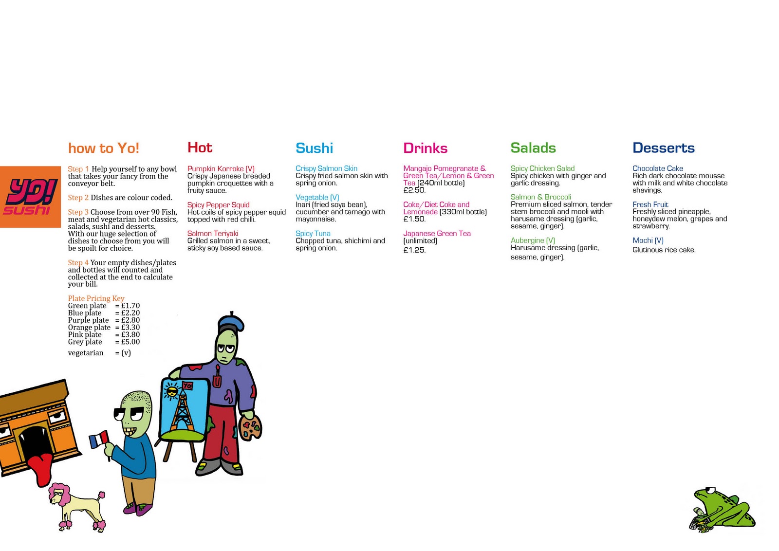
The above image is the final menu. I am now happy with my menu and how it looks and I ran it past Paul again and he also approves which is all good so now its on to the next part of the brief thank god so glad to have got the menu done and out of the way.
The next part of the brief I need to create now is my direct mail. For my direct mail I don't want to come up with something that is all in your face with a lot going on for the simple reason I receive a lot of direct mail from various companies and restaurants etc and there is usually that much going off I don't tend to read them and they find the bin straight away.
In my opinion I think the soul reason that most direct mail just gets thrown away is due to this fact. I think the more crammed packed a direct mail is the less likely you are to give it any notice. For example when I look through my post I don't tend to look at any direct mail in detail due to most of them having tons of information so I give them a quick glance and they all find the bin.
To try and stop people from doing this to my direct mail outcome I want to create something that is simple and fit for purpose with all the necessary information needed and nothing over the top or unneeded information included.
I am thinking for it to be an A4 sized outcome and I want it to be quite informal as opposed to all in your face and colors and pictures everywhere. To make it feel that little bit more important I want to create as sort of a personal letter so I want my direct mail on a4 paper enclosed in an addressed envelope to give it a more personal and important touch.
below is some of my ideas for my direct mail that I have sketched out.


After looking through my ideas I have decided to go with the below outcome as I think this idea will work the best.

I choose to go with this outcome because I believe that this particular idea will work the best I feel that in what I wanted to achieve it ticks all the right boxes. Its simple, it has all the information needed included, it has color but not to much, it has a formal structure to it and I think that its very fit for the purpose. I decided to have what I felt to be the most important parts of the text highlighted in red so at a quick glance the reader can identify the crucial points and general purpose of the direct mail.On the whole I am pleased with this idea I have not been able to show any of my lecturers for their opinions due to not being able to get into college due to adverse weather conditions. However I will be in hopefully soon so I can ask their opinions and see if anything needs tweaking etc.
The final part of my project is to create a wine label. To be honest this is the one part of the brief that I have been dreading to do as I do not know too much about wine as I am not a wine drinker and also because I dont really find designing a wine label to be very interesting at all to be honest and as its the last part of the brief my interest is subsiding slightly. However I am ready to give this brief one last final push to the finish so I cant finally put it all behind me before Christmas. So lets crack on.
Below I have included some ideas for my wine label comments welcome as always:

This idea would be one of my drawings behind a slanted banner. I think I would go with the sun image as its quite a vibrant image.

This is another simular idea, I thought that if the sun idea worked well it could be an idea to make a few wine label designs as a set.

This idea is just a very basic traditional idea with just all the basics on the front. I think for my actual design I am going to leave all the information for the back as I think it overpowers the design.

Here is another very simple character idea. tried mixing my drawings with the wine information and to be quite honest I am not feeling all the text on the front. I think I may just go for the name of the wine and then the rest could be on the back of the bottle.
Here is my finished wine label. I am not truly happy with it at all. For now I thought I would include it in my blog for the simple reason I want something to at least show my peers and lecturers so I can get some feedback and hopefully come up with a better outcome as I am not feeling this one at all but its a start/ idea to show you.

Basically this is a built up image I added a few layers together to give a bar feel so I created a simple table vector and then I added in some wine glass images and filtered them to look vectored. The Bottle I have my wine label on I found on a vector website and downloaded it. and the background image was simply brought in from Google just to create a bar background I then blurred that image so that the wine label stood out the most. As I said I am not happy with this at the moment and the label is only an idea it may need some tweaking or I may scrap it completely and go different but I am unsure yet as to what I am going to do.
Well a very short period of time and a chat with my lecturer I have scrapped that idea as I think it is just no working what so ever even though it was a professionally presented outcome I don't think if I created it better it would necessarily work any better. The main reason I don't think it would work is because it looks rather old fashioned and with my Yo! Sushi work being all modern its not going to be relevant in any way alongside anything else I have created.
So, pushing forward here are a few more sketches and scribbles to see if I cant come up with something a little bit more modern and visually attractive.

This idea would literally be a close up of my french character with a banner round his head displaying the name of the wine.

For this idea I was thinking of something simple so I was thinking maybe a white background with a banner in the Yo! Sushi orange with the name of the wine inside it. I would then place one of my drawings somewhere around the banner to suit the drawing.

This again is a quite simple idea just using a two vectors and one of my drawings. I want to try and keep the design nice and simple so I don't want to cluster it by adding lots of images and color etc.

This idea I think would work quite well I picture it in my head to work well as part of set and the only thing that would change on the label for each bottle would be the character or name of the wine in some cases. I was thinking of having the Yo! Sushi logo in the corner with the banner running out from the right in the same color this would match well with my direct mail idea and would help keep some consistency in my work.

On this idea I decided to go slightly bigger with the images. I also thought I would try having the whole middle on a slant to create a different look and feel to the design. however I think if I colored the border it might look too much.

I know this idea is very bland I just thought it might be interesting to have the Yo! Sushi logo as a center piece for the label but I think it just looks tacky.
After going thorough all my ideas good and bad I have decided that I will create the label with the Yo! Sushi logo in the corner with the extended banner coming out from the right of the logo as I think this idea has potential and I am confident that it wont be too much but also that it wont be too bland either.
Below are my final finished wine labels.


I think that my idea has turned out good I am really pleased with them. I thought instead of having a white background I would go for a light pale green. The green is the same color that I have used for my figure drawings so I think that it ties in nicely. I also like the orange vectors I think that they set it off quite nicely and the name is in my chosen font for the Yo! Sushi brief which is Euro stile. On the whole I am pleased with my label designs there not to much there just right I think the overall color ration is spot on and I think that they work well as a set and better as opposed to just the one label.
Evaluation
On the whole I am really pleased with how this brief went it has dragged on though which I didn't think it would at the start but it has defiantly seemed one of the most tiring briefs I have done its like it was never going to end. However it finally has.
There are a few aspects of my work that I would have done differently for example I would have liked to have done a more outgoing design concept for my direct mail something internet related like for example if you joined the Yo! Sushi Facebook page you got sent a code and then you won a prize when you visited Yo! Sushi. However time has not been on my side at all Im afraid its been so jammed packed with this brief and other college work like the website design brief etc which has been more of a challenge that Ive simply ran out of time.
I am happy overall with how I have progressed on this brief, there is always places you can improve on after you have finished a brief or project and I have realized that but as a whole I am satisfied with what I have achieved and created. I think the idea of using street artists as my influences has really helped me drive through this brief to get it done and I found it really enjoyable until near the end when the novelty had worn off a little but it definitely has been a challenging and different brief.
Sooo.. yeah that's about it, see you later!